The Definitive La Croix Tier List

Over these past few years, in times of toil and trouble, high school heartbreak and headaches, one beverage in particular has kept me grounded: LaCroix.

Although I am constantly ridiculed by my family and friends, I turn to this pretentious French-sounding but somehow based-in-Wisconsin sparkling water brand whenever I get a craving for soda or juice, or even just when I get bored of water. In the five years since that first fateful can of La Croix, I have had the pleasure (or sometimes, pain) of trying, apparently, 16 flavors.

Still, I concede that LaCroix is an acquired taste, so for this week’s blog, I decided to lend a hand to the La Croix uninitiated and offer the definitive La Croix tier list, based on my personal experience, so one can avoid making the same mistakes I did.

S Tier: 

  • Lime
  • Mango
  • Tangerine 
  • Black Razz-berry 

A common critique against La Croix is that the drink lacks in the flavor department (according to one Twitter comment, “La Croix tastes like it was made by a society in which flavor is the scarcest natural resource”), but I’d like to show these flavors to any skeptic.

Lime and Mango are refreshingly cool, while Tangerine and Black Razz-berry carry a welcome acidity, like a sour candy. What’s more is that they taste almost exactly the same as the fruits, or even better, the juices they mimic. Lime tastes like Sprite, Mangos tastes like that “Mango Nectar” they sell at Costco, Tangerine tastes like a Cutie (the brand of mandarin oranges), and for lack of an adequate comparison, Black Razz-berry just tastes good.

A Tier:

  • Limoncello 
  • Watermelon 
  • Lemon 
  • Key Lime

There’s definitely a big drop off between S and A tier – I wouldn’t buy any flavor in the A tier on its own, but I’ll certainly enjoy it if it comes in Costco’s La Croix value pack. Still, Limoncello and Watermelon have carved out a niche as sweet, floral flavors, evoking images of a Mediterranean town by the summer seaside. Lemon is another tried and true flavor, and tastes authentic to the real fruit, albeit more subdued than the Lime flavor. Finally, Key Lime is similar to Lime, although distinctly more artificial. If you’ve ever had Yoplait’s Key Lime yogurt, this flavor tastes surprisingly similar.

B Tier:

  • Razz-cranberry
  • Passionfruit
  • Berry 
  • Pamplemousse

Although I recall enjoying all of these nondescript flavors, I couldn’t tell you a single thing about what they actually taste like. For all I know, they could all be the same flavor masquerading as four.

Also, according to the internet’s pre-existing La Croix tier lists, Pamplemousse (Pamplemousse is a fancy French way of saying “Grapefruit”) is almost universally classified as an “S” flavor, but I have to disagree. The acidity of the drink obscures the actual grapefruit flavor too much, which, I will admit, is already a bit muted.

C Tier:

  • Cerise Limón
  • Piña Fraise
  • Hi-Biscus

Things start to fall apart in this category. Two of the flavors, Cerise Limón and Piña Fraise are part of the “Cúrate” collection of La Croix, which usually feature more “exotic” blends of flavors. Visually, the cans are a lot taller and skinnier, which apparently is supposed to make it easier to carry around, say, in one’s purse. Even as an advocate for the brand, I find this premise a tad ridiculous (who carries cans of soda around with them?), so this already docks the “Cúrate” line a few points in my book. 

Flavor wise, I find Hi-Biscus a little too chemical, and Cerise Limón (Cherry Lime) tastes just a bit like cough syrup. Out of these three, Piña Fraise (Pineapple Strawberry), is the best, but I think the pineapple flavor overwhelms the strawberry just a bit too much.

D Tier:

  • Múre Pepino

LaCroix Sparkling Water Curate, Mure Pepino (Blackberry Cucumber)- 8pk/12  fl oz - Walmart.com

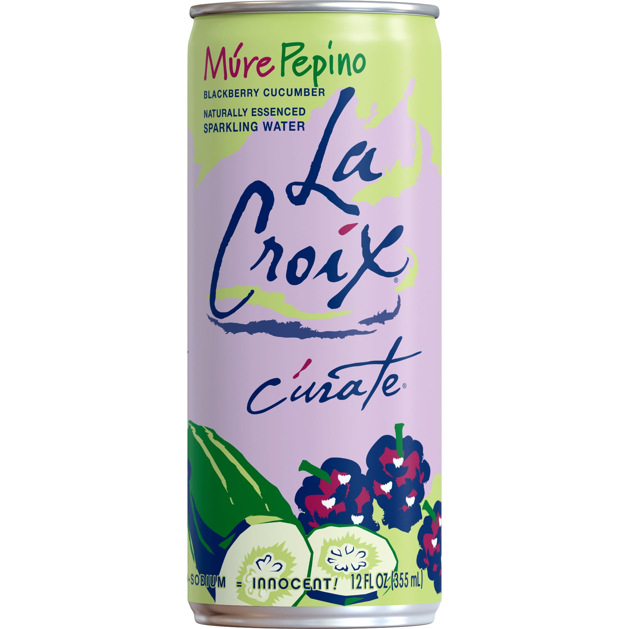
This flavor is another “Cúrate” flavor, and it’s just a fancy way of saying “Cucumber Blackberry”. If this strange combination seems a bit unpleasant, your suspicions are correct.  I’m not a fan of cucumber water to begin with, but combining it with blackberry seems to enhance that grassy, earth-like quality cucumbers have – the mixture ends up tasting just a little bit like dirt.

F Tier:

  • Peach-Pear

LaCroix Sparkling Water, Peach-Pear- 2/12 packs 12 oz - Walmart.com

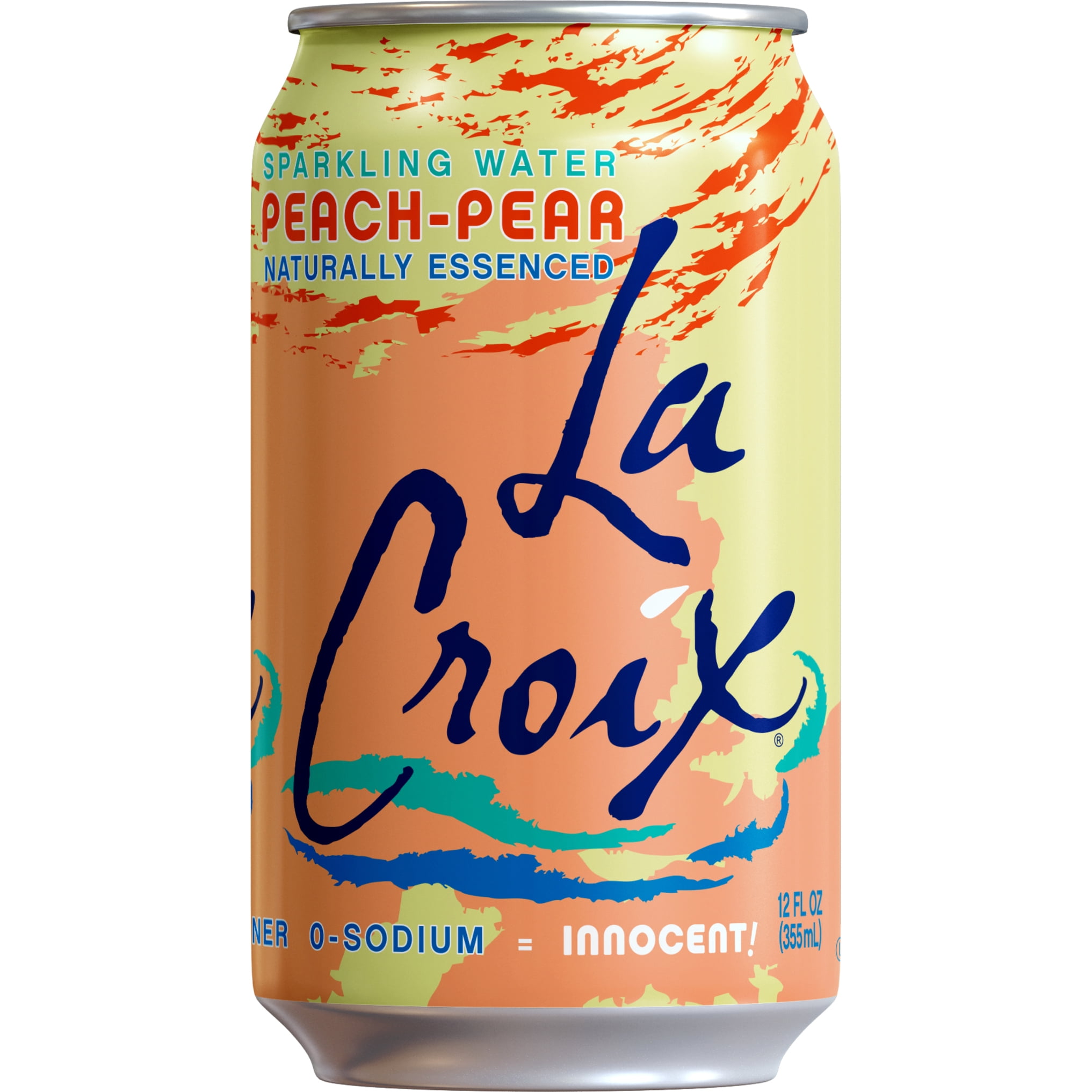
Although the other flavors manage to mimic their natural fruit flavors relatively well, this one tastes like those canned peaches served in elementary school lunch lines. It also has a strange, chemical aftertaste that reminds me of what floor cleaner smells like. I had high hopes for this flavor – in theory, it sounds like it sounds like it should work, but I was sorely disappointed. 


For now, I hope I’ve convinced at least one La Croix atheist to give the drink another shot. On the off chance that a La Croix fan, if any actually exist, stumbles upon this post, let me know which rankings you would have changed – thanks for reading!

Ode to Twitter

Ode to Twitter

If I were to track my screen time (which I do not, for fear of being confronted with empirical evidence that I am, as my sister’s English teacher calls it, a “Screen-ager”), I would find that much of my time would be concentrated on Twitter. 

Like a car crash I cannot look away from, Twitter contains it all: random people arguing about the most pointless of things, TikToks reposted on Instagram reposted on Reddit reposted on Twitter, Russian bots, and of course: really niche gimmick accounts. 

Inspired by Ivy’s recent blog post, which mentioned @depthsofwikipedia (an account I follow on Twitter), for my blog this week, I decided to highlight some extremely specific Twitter accounts I follow that bring me great joy. Enjoy!

PostcardFromThePast
@PastPostcard

I only discovered this account a few days ago, but it has quickly ascended to one of my favorites. The owner of the account, Tom Jackson, posts snapshots of vintage postcards, captioned by a line or two from the actual vintage postcard itself. Something about the sepia-filtered postcards and the often bittersweet caption manages to evoke the rawest forms of nostalgia possible, making me long for a time when people actually sent physical mail. I read every single one of the captions on this account in one of those old-timey half-British transatlantic accents.

Graphic Design History
@DesignReviewed

This account, curated by Matt Lamont, houses a great collection of posters, pamphlets, and cover designs from all over the world created during the mid 20-th century – very Mad Men-esque. I’m a really big fan of the clean, abstract, modern style from this time, and I love seeing how color palettes and fonts have changed in the nearly sixty years since. The account is definitely worth a scroll, especially since so many of the designs are just so aesthetically pleasing.

Simplified US History
@Simplified_US

History memes! APUSH was one of my favorite classes in high school, and I really do like learning about history – it reveals so much about how social values and norms can change even within the span of a few years. So when history is presented in an easily-digestible, sometimes NSFW, gen-z friendly format, I am not one to turn away. I hope at least one of these Tweets elicited a nose exhale and maybe served as a reminder that not all history is “boring” 🙂

Weird Medieval Guys
@WeirdMedieval


A breakdancing rat? A fish with legs? A bat in a hat? Twitter user Olivia Swarthout combs through literally centuries worth of digital archives to showcase the best of medieval art in this account, sharing scenes – ranging from quaint to straight up weird – from tapestries, paintings, and manuscripts from the 15th century. Replete with Swarthout’s humorous captions, this account introduced me to a side of medieval Europe beyond the traditional tales of knights and castles. Sometimes, I look at this account, and I get really sad that people decided to choose realism in art. Because although an armless frog is decidedly unrealistic, it is indeed much more amusing.

Rural Indexing Project
@ruralindexing

The premise of this account is simple: two guys drive around America, cataloging rural communities by sharing photos of local builds, landmarks, and signs. 

I’ve always been fascinated by how the built landscape varies across America and how socioeconomic differences manifest themselves visually, so this account is a very beginner friendly introduction to human geography. In addition, because the two people running this account are actually Native Chicagoans, a lot of the landmarks and buildings they post come from rural Illinois.  I recognize that Naperville is a very insulated area, so it’s always fascinating to see how differences in urban and rural communities vary not just across a continent, but even just across a state.

China in Pictures
@tongbingxue

Another history-based account (I’m sensing a theme here…). Exactly as the username implies, this account features lots of vintage Chinese photos and posters from the twentieth century. Although I have only been to China a single-digit amount of times, my parents both grew up there and immigrated to the states. I love seeing how they might have spent their childhoods and what the cities and homes they lived in might have looked like. It makes me feel a little closer to my parents, and a lot more grateful for the sacrifices they’ve made for my sister and I.

BodegaCats
@Bodegacats_

Sometimes, one just needs to unwind and look at pictures of cute cats. Thankfully, this account posts pictures of cats lounging, scrounging, and generally nosing around New York City’s numerous bodegas. I do not know why NYC’s corner stores have so many feline friend inhabitants, but I am not one to complain. 

For now, although my Twitter timeline remains insurmountably and enchantingly long, these are just some of my favorite accounts that pop up most frequently. If you end up checking any of these accounts out, let me know!

Art Critic for a Day

With our day off for President’s Day last week, my friend and I decided to visit the Art Institute of Chicago.

Although my experience with art is limited to my two and a half semesters of ceramics (and a tangential interest in art history), for this week’s blog I’ve decided to offer some commentary on the pieces I saw at the museum. Enjoy!

America Windows – Marc Chagall
(1977)

I got very excited when I saw these windows because this is where Ferris and Sloane share a kiss in a scene from my favorite movie, Ferris Bueller’s Day Off. Unfortunately, these windows have been moved to their own exhibit in the 40 years since, so any dreams of recreating that scene have vanished.

These gorgeous stained glass windows were gifted by Chagall himself to the Art Institute of Chicago in the late ‘70s, which blew my mind because I had no idea Chagall was even alive in the late 19th century, let alone actively creating art – I was under the impression that he was only active in the early 1910s and ‘20s. In fact, there’s a recreation of a Chagall painting from 1911 (I and The Village) hanging in the hallway leading to North’s ceramics classroom. 


Lozenge Composition with Yellow, Black, Blue, Red, and Gray – Piet Mondrian
(1921)


As one of my favorite modern artists, Mondrian holds a special place in my heart – I even based one of the tiles I made in ceramics last semester off of his works. I love the simple, yet striking, nature of his compositions, and it fascinates me how these combinations of lines and primary colors can create a work that’s so geometrically harmonious. 


Water Lilies – Claude Monet
(1906)

Perhaps no artist exemplifies art’s impressionist period better than Monet. Although I’d seen pictures of his paintings online, seeing these famous flowers in person drew my attention to an oft neglected facet of his artwork: the texture. Each brush stroke ends in these little dimples and freckles of paint, creating this sense of relaxed airness, almost like the ripples of a pond. 


Landscape at L’Estaque – Georges Braque
(1906)

I initially thought this painting was by another one of my favorite artists, Henri Matisse. It turns out, however, that both Matisse and Braque belonged to a French art movement in the early twentieth century known as Fauvism, which is characterized by bright, almost lurid, colors, and coarser brushwork. I love the warm, golden hour-esque colors of this piece – the painting somehow captures the essence of sunlight without directly depicting the sun or its rays. 


The Interior of the Palm House on the Pfaueninsel Near Potsdam – Carl Blechen
(1834)

For such an impressive name, this painting certainly delivers on the grandeur. There’s a fantastic sense of depth created by both the palm fronds framing the exterior and the dark recesses of the atrium in the back, leading to this lofty, open-air sort of feel. I’m a sucker for any plant/botanical related art, but I also included this painting because I think it contrasts the way sunlight is expressed in the previous work. Whereas the previous one focused almost entirely on the sun aspect, this one emphasized the light. I can’t explain it, but this painting feels like a breath of fresh air. 


Liz #3 – Andy Warhol 

(1963)

My only thought upon seeing this painting: the eponymous “Liz” looks like Michael Jackson. 


The Key – Jackson Pollock
(1946)

This work feels disorientingly flat, as if Pollock managed to compress all dimensions into one. The brighter, more textured brushstrokes (from a distance, the piece almost looks as if it was drawn with crayons) depart from the usual neutral-toned splatter-paint works that Pollock is more known for, which was a pleasant surprise. 


Daniel-Henry Kahnweiler – Pablo Picasso
(1910)

The obvious question: Who was Daniel-Henry Kahnweiler? 

The ever-helpful blurb to the right of the painting answered it: Kahnweiler was an art dealer from Picasso’s era and one of the earliest supporters of cubism. This work, indeed, is in Picasso’s famous cubist style. For me, the most interesting thing about this art style is that it’s no longer color or shading that distinguishes features, it’s geometric shape

In AP Psych, we learned that as long as the first and last letter remain intact, people can generally recognize a word if the interior is scrambled. I wonder to what extent the same can be said for faces. How many facial features can be distorted or omitted entirely until we no longer recognize it as a face?


Distant View of Niagara Falls – Thomas Cole
(1830)

I (quite proudly) recognized this painting because it appeared in the APUSH textbook as an example of American romanticism, the movement that emphasized individual emotion and a return to nature. For a painting whose subject is so grand, however, I was taken aback by how small the physical painting is – it’s only about a foot and a half long. 


Although my visit to the Art Museum was accompanied by six total miles of walking, two extremely sore feet, and the joy of Chicago public transportation, having the chance to see some of the world’s most famous (and more obscure) paintings in person is invaluable – I highly recommend it if you get a chance. 

For now, I hope you all enjoyed this virtual tour!

Artichokes, AP Lit, and Allen Ginsberg: Notes on “A Supermarket in California”

While reading “A Supermarket in California” from my Bedroom in Illinois, I experienced Confusion in Large Quantities.

Like a bucket of ice-cold water, the speaker made it immediately clear who their audience was: Walt Whitman. Intuitively, it seemed that Whitman was acting as some sort of symbol for a broader idea, but I didn’t have a clue as to what this idea was. In previous poems we’ve read, the symbols have always been at least somewhat established objects or places. Even if the speaker subverts the established use of the symbol, at least there’s an established idea to subvert in the first place. However, I didn’t know of any established symbolism for Walt Whitman, so I had little to operate off except some vague prior knowledge. Thus, the central question that guided my read of the poem was: What does Walt Whitman represent?

I discovered an answer to my question in two main ways: historical context and textual evidence.

The Beat Generation: The Beatniks

The Beat Generation.

When I read, I often contextualize the poem in the time period when it was written. I knew from APUSH that Ginsberg was one of the leading writers from the Beat Generation, a mid twentieth-century movement that often criticized mainstream American consumerism and culture. I noted that the examples of produce given were all foreign imports, suggesting a preoccupation with obtaining as many goods as possible. In addition, the phrase “shopping for images” seemed to reference the idea that we buy goods to create an illusion of wealth rather than out of actual necessity. With regards to Whitman, I also knew (from APUSH) that he was part of American literature’s Romantic movement, which emphasized individuality and a return to nature. These ideas directly contrasted the artificial, materialistic conformity the supermarket represented, and I began to sense that Whitman symbolized these Romantic tenets.

There’s also another more direct reference to consumerism at the end of the poem – the blue automobiles. I immediately thought of the bright blue Volkswagen beetles that dominated the ‘50s and ‘60s; perhaps nothing exemplifies materialism better than an excessively flashy car. This car is contrasted with the “lost America of love past,” the America, presumably, of Whitman’s time, an America that embraced authenticity and individualism over consumerism.

Finally, a nod to one “Garcia Lorca” helped support my theory. Unlike Whitman, I had never heard of them, so a Google search revealed that Lorca was an early 20th century Spanish poet who was executed for refusing to hide his leftist beliefs or homosexuality against Spain’s fascist regime. This seemed consistent with the counterculture ideas of Ginsberg, and it bolstered the idea that Whitman could also serve as a symbol of a counterculture in his own way.

Having racked my brain (and Google), I shifted my attention to the text, hoping to find evidence to either confirm or deny my suspicions.

Within the second stanza, I was initially confused by why the speaker, who seems to heavily respect Whitman, spends the first line blatantly insulting him, breaking this consistency. However, once I began thinking that Whitman represents a rejection of the consumerist, superficial society represented by the supermarket, I realized that Whitman’s solitary lifestyle could also be seen as a rejection of social norms, such as the nuclear family of the ‘50s. Being a “childless, lonely old grubber,” at least to the speaker, may not necessarily be a bad thing.

Similarly, the final stanza reinforced the idea that Whitman serves as a role model for the speaker because of the ideals he represents; the speaker reveres him as sort of a grandfatherly, virtuous figure, calling him a “courage-teacher”. They also direct a string of questions towards Whitman, as if they depend on Whitman for guidance (Whitman’s beard appears to act as a moral compass). Indeed, when I looked closer, even the punctuation seemed to hint at the speaker’s attitude towards Whitman. In the first stanza, the repeated use of exclamation marks paralleled the tile of Whitman’s most famous poem, O Captain! My Captain!. By emulating his writing style, the speaker hints at both the ideological and the literary influence Whitman has had on them.

I found my final clue in the poem’s ending reference to Greek mythology. Out of all the references throughout the piece, these couple of lines gave me the most trouble because of how random they felt – it was almost jarring to experience this sudden switch from the balmy California night to the bleak banks of the underworld.

I knew Charon was the ferryman who transports souls from the living world to the underworld, but I had never heard of Lethe. After another Google search, I discovered that those who drank from the waters of Lethe would experience complete forgetfulness. This led me to believe that America itself was the ship sailing down the Lethe, and the continually referenced darkness outside the supermarket was that of the underworld. The speaker was making the point that the country had sailed past a point of no return, hopeless to the point that even Charon had abandoned it, having completely forgotten the Romantic ideals of Whitman’s time.

Upon deciphering the entire poem, I began to wonder: why would Ginsberg choose such an unconventional, specific symbol, one whose meaning wasn’t immediately obvious?

Ultimately, I believe it’s because Whitman’s presence allows for the expression of a much more precise idea. While there are established symbols that express similar beliefs, no object specifically expresses the ideals of 19th century American romanticism as accurately as Whitman does – his name allows Ginsberg to nest a much more complex idea into one reference, one that a “conventional” symbol can’t necessarily reflect. Inventing a symbol allows for the formation of an idea that most directly and powerfully juxtaposes the commercial American supermarket.

Thus, although the comprehension of this piece posed a unique challenge by demanding that I draw on prior knowledge or consult outside sources, for me, one of the most exciting things about reading anything is finding ways to connect what I’ve learned in one subject to another. Especially because I haven’t had a chance to do so as thoroughly in any poem we’ve read before, I enjoyed discovering the intersections between history and literature in the space carved out by “A Supermarket in California”.

2022, in Music

With the influx of second-semester-senior no-college-applications-left free time, one of my personal goals this year is to listen to music – more of it, and in more genres. That being said, I thought it would be fun to share a sort of musical time capsule of the albums and genres that defined my 2022. 

Solar Power (2021) – Lorde

Definitely a different sound compared to her past albums – lots of layered harmonies, mellow acoustic chords, and wistful lyrics culminate in a wholly atmospheric, folksy album. I’ve really enjoyed the evolution of Lorde’s music over the past decade, and I like when artists are able to transcend the style of music they originally gained prominence for. Also, the appropriately breezy, beach-themed music video for Solar Power is visually fantastic, offering a welcome respite from a bleak midwestern January winter. 

Aja (1977) – Steely Dan

I. Love. Steely. Dan. It remains somewhat of a mystery why the melodically-driven, jazz-infused, 1970s yacht-rock of this band resonates with me so much, especially when their core fanbase seems to be compromised by middle-aged white men, but the heart wants what it wants. Every one of their songs is a masterclass in chord progressions, evocative lyricism (Quoting Deacon Blues: I crawl like a viper / through these suburban streets), and audio mixing, but Aja remains, in my opinion, their best album.

Come Away With Me (2002) – Norah Jones

No lie, there is not a single bad song in this album. Norah Jones’s voice is super distinct, and perfectly suited to the acoustic blend of jazz, country, and folk that characterizes Come Away With Me. I grew up with this album, so it has sentimental value – my mom owns the physical album, and I have vivid memories of her playing it on every car ride when I was, like, five. 

Honestly, Nevermind (2022) – Drake 

I’ll admit it: I like Drake. I have no idea how, but he ended up as my number one artist on Spotify wrapped last year. Although perhaps not the most musically groundbreaking or lyrically intricate stuff, there’s a certain easiness to Drake’s music – you know what you’re getting. At the junction of hip-hop, r&b, and pop, his melodies are catchy, and his rhythms get me tapping my foot. But within all this, Honestly, Nevermind feels like a breath of fresh air. The album strays away from established precedent to entertain a more minimalist, groove-heavy, house style. I actually started listening to a lot more dance/house music last year, so I’m a fan. 

Windflower (1978) – Herb Ellis & Remo Palmier ‎

One of my favorite instrumental jazz albums of all time. Not a recent discovery, but one I keep coming back to. The lush guitars of Ellis and Palmier layer over each other beautifully, and there’s a great mix of both slower and upbeat songs within the album so it doesn’t get too repetitive. For any who haven’t really listened to jazz before, this album is a good introduction to the genre, especially since they cover a lot of standards (honestly, I think this version of My Foolish Heart is better than the more famous Bill Evans one). It doesn’t exist on Spotify, so here’s a link to the youtube video: https://www.youtube.com/watch?v=fAi7IeJG-6Y&t=649s

Juno / I’m Allergic To Dogs (2021/2020) – Remi Wolf 

Rare tie alert: Couldn’t decide which album to include, so I listed them both. All-around fun, upbeat, funk-infused pop, Stevie Wonder’s Gen-Z resurgent. Makes you want to get up and dance, which is saying something, because as a general rule of thumb, I don’t dance. American advertising executives seem to think so too, because I’ve heard her songs featured in multiple independent ads, most strangely, for Kraft Mac and Cheese. 

 Dreams (2022) – Elephant Gym 

Another instrumental album – this time, math rock. Math rock gets its name from the atypical time signatures, complex electric guitar riffs, and rhythmic drum patterns that characterize the genre. I started listening to it a lot more over 2022, and although I’ve had some time to play around with my trusty Yamaha acoustic guitar over the past few years, the technical skill needed for this style humbles me every time. I like this album because it’s more downtempo; in contrast to a lot of math rock, these songs start off a little slower with a focus on the guitar instrumentals before picking up with a drum solo. 

Of course, let me know if you have any recommendations – any genre! I’m down to listen to pretty much anything and I love discovering new stuff. Thanks for taking a musical journey down memory lane with me 🙂

In Retrospect

The forest where most of the crying happens

I won’t be alone in saying that the first semester of my senior year was a tumultuous one. I was challenged by coursework, college applications, extracurriculars, and the act of judiciously balancing all three together. 

More than anything, I was challenged by the act of feeling.

I spent a lot of my underclassmen years trying to stifle any emotions or personal challenges I was facing by preoccupying myself with loads of work (or Netflix). I wanted to keep myself busy at all times so that I wouldn’t have to confront anything I was going to at the time; I marched through life with a straight face because I was convinced that it would all be “worth it”; i.e, I would get into a “good” college and it would not matter that I had suppressed all the stuff I felt because doing so had landed me this result. 

The most difficult part about this year has been confronting and correcting that ideology. Over the course of these few months, like some sort of emotionally exhausting Chinese water torture, I’ve realized that that’s not true. That there’s a very real chance that no matter how many feelings I stifled in favor of aggressive productivity that I won’t arrive at an outcome my 15 year old self would have envied. And I’ve had to make peace with that, slowly, and sometimes painfully. I’ve had to redefine the way I view failure, not as an inability to achieve a result, but as an ability to recognize and prioritize the value of what you sacrificed to try and achieve that result. It’s cliche, but you’ll really only grow up once. You’ll only feel all the terrible and awesome emotions of growing up once. 

This realization was catalyzed, in part, by practicality. As I learned more about the volatility of the college admissions process, the more of a logical fallacy the catch-all “hard work equals success” seemed to become. The more prominent reason, I think, was that of exhaustion. It takes such a big toll on your mind and body to maintain such a high level of apathy. It builds up, like if you shake a bottle of coke, and then it all overflows, in one big great wave. Maybe it was because I was caught up in the adrenaline of it all, or enchanted by my freshman self’s naive musings, but I don’t think I realized how tired I was until this year. 

I’m still tired. But now I take walks while crying in snowy forests and scream into pillows. I ride the rollercoaster that is the five stages of grief instead of walking past it. And that’s helped.

I’m entering second semester with the same mindset. It should be easier, I think, without the stress of college applications. I’m still learning how to stop using a preoccupation with productivity as a band aid for much deeper wounds. I want to get absurdly good at the guitar; I want to make more Target runs. I want to watch movies at midnight; I want to actually make use of the state’s allotted mental health days. I want to spend what time I have left in high school with my friends instead of distracting myself with schoolwork and whatnot as a way to compensate for everything I didn’t do right.

I hope any incoming seniors reading this (if any) take time to rest now, next semester, and your senior year. Let yourself feel and breathe. It’s ridiculously unhealthy to make being a “workaholic” a point of pride, no matter how much parents or others encourage it. I think the worst thing you can do as a senior is punish yourself for taking time off, whether it’s a mental health day to process a college decision letter or hitting the mall on a random Wednesday. Maintaining a facade of apathy is exhausting, but so is unwavering optimism (it can get repetitive hearing “you’ll be okay wherever you end up!!”). First semester senior year is a really difficult time, so acknowledge it as such. If you’re like me, it’ll feel weird, at first. But the more you do it, the easier it’ll become. 


The Golden Age of Television

The Golden Age of Television

Sleigh bells, Christmas lights, pine-scented candles – it truly is that time of year again. Thus, in the spirit of giving, I am giving a gift to myself: another self indulgent blog post. 

As a fervent enjoyer of television, since discovering Netflix in middle school, I have spent the last few years refining my fine palate of TV shows. Like a wine sommelier, but for the screen. 

Although perhaps my parents would disagree, I don’t think watching TV is (entirely) a waste of time. At the very least, from each of the shows I’ve mentioned, I’ve learned a little bit more about effective storytelling. These are all shows that have made me laugh, cry, and run to IMDB to have critics validate my feelings. The ability to tell a compelling story, whether through dialogue, music, or visuals is a power I envy. 

So, taking a page out of Chris Rowe’s handbook, for my final blog of the year, I’ve decided to review some of my favorite shows. 


Breaking Bad // Better Call Saul 

Breaking Bad (and its spinoff Better Call Saul) is a masterclass in ambiguity. Rife with black humor, Breaking Bad details the transformation of Walter White, a chemistry teacher who begins to produce and sell meth to pay for his cancer treatment; Better Call Saul is about the rise and fall of Jimmy McGill, Walter White’s lawyer. Vince Gilligan, the creator of the show, so effectively captures the idea of the moral gray ground that your allegiance to a character or a storyline changes from episode to episode – you’re never consistently rooting for or 

against the main character, and that’s what keeps you hooked. I usually have a hard time getting into dramas (looking at you, Succession and Peaky Blinders) – I find them slow and, ironically, lacking drama, but Breaking Bad/Better Call Saul was a happy exception. 


Gilmore Girls

Perhaps it’s a little odd that 2000s teen slice-of-life dramedy Gilmore Girls is appearing right after the somber pair of Breaking Bad and Better Call Saul, but like the Breaking Bad-verse, the characters of Gilmore Girls are painfully, beautifully, imperfect. They make mistakes and pay for them. Set in the idyllic small town of Stars Hollow, Connecticut, Gilmore Girls chronicles the growth of mother-daughter pair Lorelai and Rory Gilmore over the course of multiple years, as both manage relationships, work, and school. The seemingly simple premise of the show allows it to focus on the minute, everyday emotions of life; for Rory, of growing up, for Lorelai, of confronting her past. Aided by the quick, witty, pop-culture reference filled writing of Amy Sherman-Palladino, Gilmore Girls has blossomed into a cultural phenomenon of its own – and with good reason. 


Arrested Development

Arrested Development has the best writing of any show I’ve ever watched. Period. Detailing the shenanigans of the dysfunctional Bluth family and their real-estate business, this witty, fast-paced 2000’s ensemble sitcom weaves together storylines – not just across multiple episodes, but multiple seasons – so masterfully that by the end of each episode one can only sit in awe, jaw agape, in breathless amazement at the Herculean feat that has just been accomplished. The show has also mastered the art of the callback, bringing back recurring jokes, not just in passing, but so that they form major plot points as well (Her?). A must watch for any fan of comedy. 


Taskmaster

I discovered this show last winter break, and boy am I glad I clicked on that random Youtube recommended clip. Hosted by Greg Davies and Alex Horne, this British game show features a new cast of five British comedians who compete in a series of ridiculous “tasks” over the course of each season. Tasks include trying to draw a rainbow in the dark and ordering a pizza without saying the word “pizza” (and other related words). Hilarity ensues. For someone who has always been a fan of that punchy, sarcastic, style of British comedy, this show was right up my alley, even if it wasn’t something I would have sought out on my own. 


Last Week Tonight with John Oliver 

Straying away from the world of fiction, British comedian John Oliver’s late night show delivers a sharp 20 minute segment each week as Oliver offers his take on some of today’s most pressing social and political issues. Last week, for example, he covered the human rights abuses committed by Qatar in light of the World Cup. Pulling quotes from interviews, statistics from news articles, and clips from local news segments, Oliver’s carefully researched program brings together a variety of to build a compelling argument, making the show not only a news source, but a valuable lesson in writing powerful editorials as well. Interspersed with Oliver’s jokes and comedic musings, I credit Last Week Tonight with helping spark my interest in current events and making the news, which can often feel daunting, much more accessible.  


Let me know if you’ve watched any of these shows or have any recommendations – I’m always down to talk TV. Happy Holidays!

Photos from Banff

This past summer, for our first vacation since COVID, I traveled to Banff National Park with my family. Banff, located in Alberta, Canada, is famous for its mile-high granite mountains, crystal-clear lakes, and endless conifer forests. 

There is such an indescribable vastness to Banff. 

It is a strange feeling to be driving along the Trans-Canada highway with your family, where the only sign of humanity is the slender, winding road that cuts neatly through the trees. Then, it disappears beyond the bend, and you are alone again. On both sides of you there is forest, and beyond that, there is sheer, gray, cliff. Above that, there is sky. 

Armed with my dad’s camera and a very rudimentary knowledge of photography, I attempted to capture this feeling of emptiness. Because I know I could not do Banff justice in 700 words, here are a few of my favorite photos from that trip. 

Emerald Lake

As close to desktop-wallpaper worthy as I’ll ever get, this photo was shot at Banff-adjacent Yoho National Park’s Emerald Lake. The lake owes its brilliant aqua color to the sunlight reflecting off the finely powdered rock deposits suspended in the water. As the glaciers on the neighboring mountains each spring melt, they erode the mountains, carrying this “rock flour” with them as they feed into the lake.  On sunny days, the water is clear enough that it will perfectly reflect its surroundings, but it was a cool, foggy day when we went. Still, I like the soft, purple mist that swallows the tops of the mountains. 


Banff Springs Hotel

Pictured here: The Banff Springs Hotel, arguably one of the most famous hotels in Canada. Built in 1888, the Banff Springs was one of Canada’s earliest railway hotels, a series of luxury hotels constructed alongside Canada’s expanding railway system as a way to encourage tourists to travel via train. Photography-wise, I like this photo because it feels like a still from a dramatic movie; it reminds me of the hotel from The Shining. The hotel itself, built in a Châteauesque architectural style, provides a visually interesting subject – the steep roof, spires, and red-brick give it quite a European renaissance feel, and as a result, it looks a lot older than it actually is. 


A clearing in the forest

My favorite photo from this trip, not for its vastness, but for its intimacy. To me, there is something really special about its framing, almost as if we’re peeking in on this secret slice of life. It has a hazy, dream-like quality, like it’s a distant memory; for some reason I can’t explain, it makes me nostalgic. 


A baby bighorn sheep

The (considerably uglier) adult bighorn sheep

Perhaps not the most visually stunning couple of photos, pictured here are a baby bighorn sheep and its mother. We were fortunate enough to see quite a few wildlife during our trip, including an adult bighorn sheep, a black bear, and a mountain goat. Beyond the novelty of the wildlife, however, I must admit that the bighorn sheep is quite an ugly animal.


Among the lodgepole pines

I wanted to capture the sensation of feeling very small in this photo. I hiked my fair share of trails in Banff, and in all of them, nestled against the pines and the sky and the mountains, I noticed the quiet. Save for the rustling of the trees and the occasional whisper of the earth, in the forest, it is still in only a way nature can offer.


The aptly named Kicking Horse River

I couldn’t decide which photo I liked better between these two, so I’m including them both. This was my first time shooting moving water, and since I don’t have the equipment to shoot long exposure (a technique involving a drastically slower shutter speed that is often used to show movement), I thought that they turned out well enough for a first attempt. It’s not immediately obvious from the photo, but the water here is moving quite quickly – so much so that behind where I was standing, the force of the rapids has carved through the cliff spanning the river, forming a “natural bridge”. The blue and red jackets also offer the photo a bright splash of color – although I intended for the water to be the focal point of the photos, I’m finding that my eye is drawn more to the people. 

Whatever the case, no photo, however well-shot, will ever replace the feeling of actually being somewhere, especially a national park. While I doubt I’ll return to Canada any time soon, I’ll be taking advantage of this bizarre climate-change-induced seventy degree November weather for as long as it lasts. There really is no substitute to spending time outside. 

As always, let me know which photo was your favorite!

A Tour of My Plants!

Having been an avid collector of plants since eighth grade, for this week’s blog, I thought I’d show you around some of my plants – enjoy!

String of Pearls – Senecio Rowleyanus

String of Pearls

True to its name, String of Pearls is a delightful curtain of emerald beads that drape delicately across the edges of their container. Like most succulents, it can be propagated, meaning you can actually cut off a small section of one of these “strings”, stick the end in soil, and it’ll grow into a new plant. I’m planning on letting my String of Pearls grow a bit more before I propagate it, however. 

We just finished making our hanging planters in Ceramics 2 and will be glazing them this Friday, so I’m planning on repotting this plant in one of those planters – I’m really excited to see how that turns out. 


Little Hope – Philodendron Selloum

Little Hope (plus a special guest!)

“Little Hope” is a miniature version of its more lanky relative, the stalwart Philodendron. Originating from the jungles of South America, it’s a pretty low maintenance plant – it’s happy as long as its soil is moist and is placed in indirect sunlight. I bought this plant a couple of years ago from Home Depot, that wonderful treasure trove of hardware, home improvement materials, and most importantly – plants.

Unfortunately, over this past summer, my Dad (with good intentions) set this plant outside on our porch “to get some sun”. Greeted with the full force of the blazing ninety-degree midwest sun, however, it quickly shriveled up and many of its leaves dried up and died. Nonetheless, Little Hope has made a stellar recovery and has put out a lot of new growth in these past couple of months. 


Spider Plant – Chlorophytum Comosum

Spider Plant

Featuring long, slender leaves with a white stripe running down the center (this type of two-tone coloration is known as variegation), the sprawling limbs of the spider plant, indeed contribute to quite an arachnoid feel. 

We’ve had this plant for more than five years; it was gifted to us by a family friend and has produced generations of baby spider plants since then. The spider plant reproduces through offshoots, tendrils of baby plants that extend from the main plant. Because there is already a small set of roots at the base of the baby plant, you can detach one of these offshoots from the main plant, pot them, and they’ll grow! Usually, however, I prefer to stick the baby in a glass of water for a couple of weeks to help the roots grow a bit bigger before potting them in soil. 


Inchplant – Tradescantia zebrina

Inchplant

There are over 85 varieties of tradescantia, but I just have the one. This plant started as a handful of cuttings collected from the floor of the Jewel Osco greenhouse (the inchplant can also be propagated via plant clipping). I’ve only had the plant for a few months, but in that time, it’s transformed from a humble cluster of stems, barely eclipsing the edge of the pot, to this gargantuan mass of foliage.

This is actually my second inchplant – the first one was accidentally given away by mom during the summer of 2020 to the people remodeling our house at that time. I like to think that the current inchplant has grown extra large in order to avenge its fallen sibling. 


Chinese Money Plant – Pilea Peperomioides

Chinese Money Plant

 The cute, saucer-like leaves of the Chinese Money Plant are said to bring good luck. The healthier the plant, the more fortune it will attract. Unfortunately, while not unhealthy, my Chinese Money Plant really hasn’t grown all that much since I got it (again, from Home Depot) a couple of years ago. There was a period of time last winter when my plant started losing leaves like crazy (I’m still not sure why), but that seems to have stabilized – it appears, slowly but surely, to be putting out new growth. 

A mature Chinese Money Plant will produce pups, little baby plants that sprout up from the soil around the base of the main plant. These pups already have roots attached, so they can be immediately repotted and will grow into new, adult plants. While some of the larger pileas I’ve seen have dozens of baby plants growing at once, mine only has two.


These five plants are only a small sample of my well-established collection – I have about a dozen more, which perhaps warrant their own blog post for some other time. But for now, let me know in the comments which plant was your favorite!

Ranking The Fat Bears.

Gone fishing.

It’s a bird! It’s a plane! No, it’s just a particularly fat bear.

As I write this, we are nearing the end of Fat Bear Week, a tournament honoring the fattest bears over at Katmai National Park.

Katmai, located at the tip of Alaska, accommodates thousands of brown bears and sockeye salmon. From June til October, the bears gorge on said salmon in preparation for winter hibernation, gaining considerable amounts of weight in the process. You can actually watch the bears fish over at explore.org through a 24-hour live stream; I highly recommend it. It is peak cinema.

Anyway, as they have for the last eight years, Katmai’s rangers select the bears that have packed on the most pounds and hold a single-elimination, bracket-style election*, letting the public decide who is most worthy of the prestigious title of fattest bear of the year.

Voting uninformed, however, is never a good idea. Luckily, every bear is presented with a name, photo, and a biography, a short description of their quirks and characteristics. I feel as if, over these past few days, I have truly gotten to know all of these bears on a deeply intimate, personal level. It’s whats on the inside that matters, too, not just what’s on the outside (which is a layer of fat).

Having successfully fulfilled my Fat Bear Week civic duty, I now feel it is my responsibility to share with you, lucky reader, my definitive top three ranking of the Fat Bears, in order of fatness.


In third place: 901

A relative newcomer, born in 2016, 901 has taken the world by storm. Her motives are altruistic, however, as the extra weight she’s put on may go towards rearing cubs this winter – bears without enough fat are unlikely to give birth. Yes, female bears give birth while they hibernate. I did not research the logistics.

Whatever the purpose, 901 has sized up significantly, going from a bony underling to an absolute monster. I bet if she stood on that rock now, it would simply crumble.


In second place: 435 Holly

A Fat Bear veteran, 435 Holly has been making the rounds since first being identified in 2001. Since then, she’s raised several rounds of cubs, even adopting another cub along with her own in 2014. Having been on her own since sending her most recent cub off this past spring, she’s had a little more time to work on herself, and the results have shown. And yet, she remains humble, head bowed, carrying herself with all the quiet humility of someone that has seen and felt it all.

Side note: the website describes her fur as a “lightly toasted marshmallow colored”, which also merits bonus points. Anything described as a “lightly toasted marshmallow colored” elicits feelings of warmth and hot chocolate and all things good, even fat bears.


In first place: 747!

Aptly named after the plane, 747 exemplifies fatness. Clocking in at a hefty 1400 pounds, he rules over Brooks Falls, Katmai’s most famous bear-watching spot, with an iron grip, having solidified his spot as the alpha male earlier this summer.

Beyond his sheer weight, however, 747 is even more deserving of the title because of his progression. He looks so forlorn in the first photo, all wet and dripping like that, almost like a sad puppy. Three months later, he’s not playing around. I’m a little intimidated just watching him barrel his way downstream from the comforts of my computer screen. If I were a fish, I’d be scared.

Ultimately, Fat Bear Week is just a warm-up for the real deal. Having just turned eighteen a month ago, I’ll be voting in the midterms this November. I’m trying my best to keep up with election news and candidate profiles, though admittedly, it’s getting harder and harder to find time to do so. What’s most important, however, is that I’m voting in the first place. Though my parents are both citizens, and despite my consistent nagging, they haven’t voted in any of the last presidential elections, much less the midterms.

I’m determined to break the cycle, starting with Fat Bear Week.

*If you’d like to read more about the tournament and view all candidates/winners (again: highly recommended), you can check it out here: https://explore.org/fat-bear-week.

Skip to toolbar